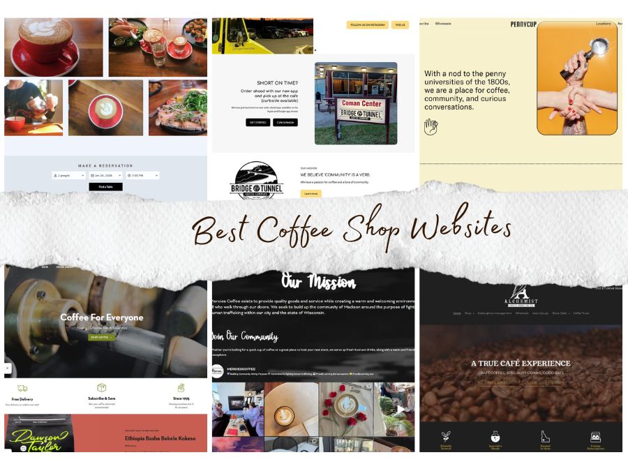
Best Coffee Shop Websites
Great website design is rarely about trends or templates. It’s about intention, restraint, and understanding the business behind the screen. When design works well, it often goes unnoticed because it feels natural and unforced.
For this roundup, we reviewed coffee shop websites from cities across the United States and selected examples that stood out because they felt considered. These are sites that communicate clearly, use space and typography with confidence, and reflect the character of the businesses they represent without excess or noise.
This list isn’t about popularity. It’s about design that feels purposeful.
Ohori’s Coffee
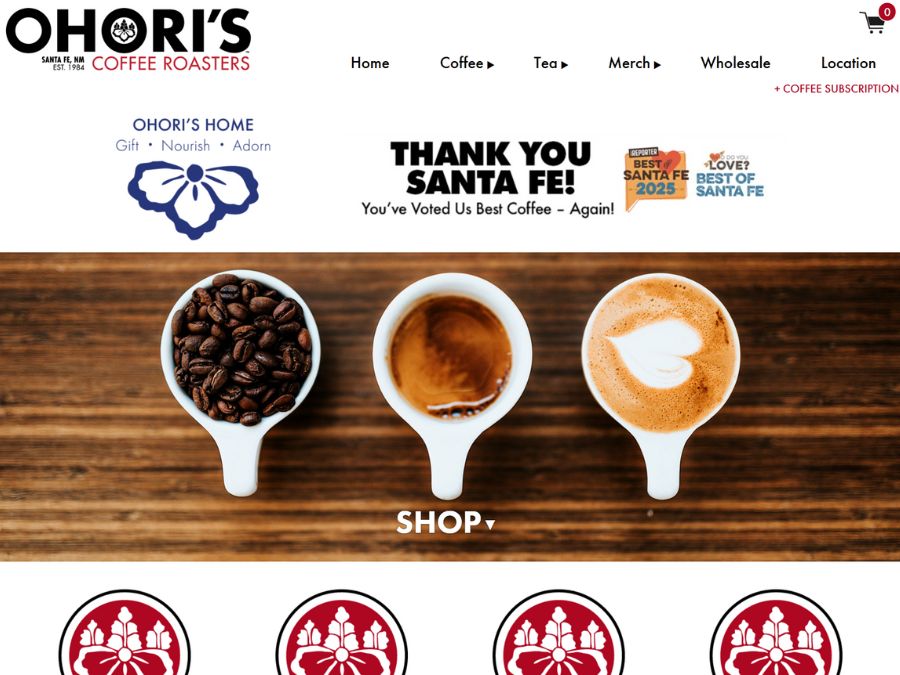
Why We Picked It
Structure and clarity guide the experience here, with a layout that prioritizes navigation and readability over visual flourish. Content is arranged in clearly separated sections that make it easy to move between product information, story, and practical details. Typography remains restrained and consistent, allowing imagery and content to set the tone rather than decorative elements. The result is a site that feels composed, functional, and deliberately paced.
Website details:
Industry: Coffee shop
City/State: Santa Fe, NM
URL: https://ohoriscoffee.com/
Cafecito
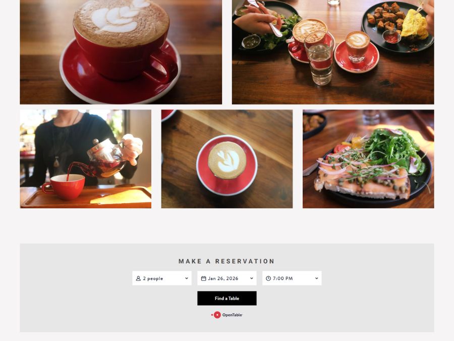
Why We Picked It
Information is presented with calm precision, giving menus, location details, and background equal visual weight without competition. Navigation is straightforward and unobtrusive, helping visitors orient quickly. Photography is integrated sparingly and supports a sense of place rather than acting as decoration. The overall design favors clarity and balance, reinforcing the feeling of a thoughtfully run local space.
Website details:
Industry: Coffee shop
City/State: Santa Fe, NM
URL: https://www.cafecitosantafe.com/
Mercies Coffee
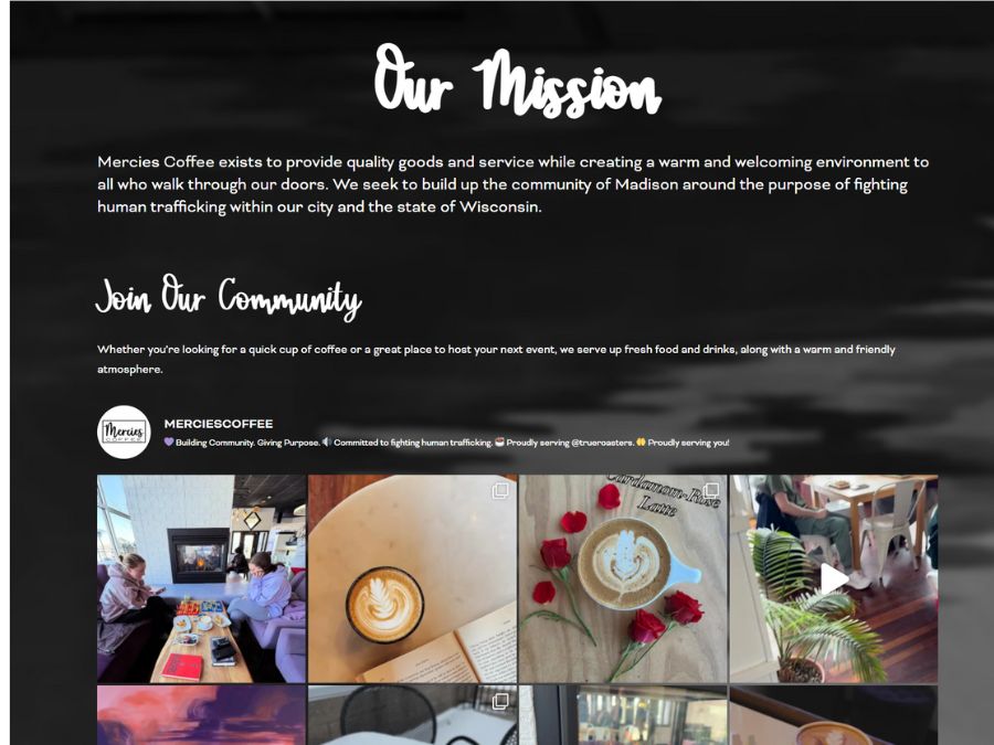
Why We Picked It
The homepage establishes hierarchy through clear section breaks and generous spacing that guide attention naturally down the page. Typography is clean and legible, with enough contrast to distinguish headings from supporting content. Photography is used selectively, grounding the site in its physical environment without overwhelming the layout. The design choices feel measured and intentional, supporting a calm and approachable presentation.
Website details:
Industry: Coffee shop
City/State: Oconomowoc, WI
URL: https://merciescoffeewi.com
Alchemist Coffee
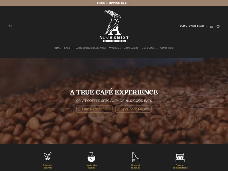
Why We Picked It
Content is carefully segmented to balance café information with online shopping without visual confusion. Navigation clearly separates these functions, helping users understand the site’s structure at a glance. Typography remains restrained, while spacing prevents the page from feeling dense despite its range of content. The layout reflects deliberate choices aimed at maintaining clarity across multiple use cases.
Website details:
Industry: Coffee shop
City/State: Boise, ID
URL: https://www.alchemistcoffee.com/
Provided Coffee
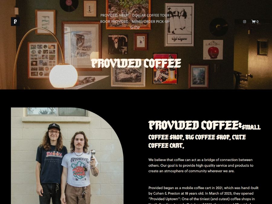
Why We Picked It
The homepage uses a centered identity and simple navigation to establish focus and clarity from the outset. Content is spaced to create a quiet visual rhythm that leads the viewer through brand story, locations, and offerings in a cohesive sequence. Typography feels restrained and readable, giving each section room to register without visual noise. Imagery supports context without overwhelming the layout, helping the design communicate its character with intention and calm.
Website details:
Industry: Coffee shop
City/State: Concord/Charlotte, NC
URL: https://www.providedcoffee.com/
Dawson Taylor
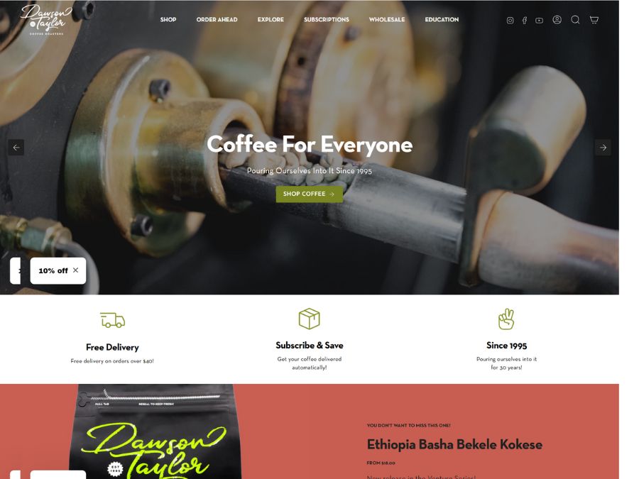
Why We Picked It
Content unfolds in a deliberate sequence, moving from brand story to products and locations without visual congestion. Clear typographic hierarchy establishes order, while consistent alignment and spacing reinforce structure across sections. Imagery supports context rather than competing for attention, keeping the layout focused. The design balances complexity with clarity through careful composition.
Website details:
Industry: Coffee shop
City/State: Boise, ID
URL: https://dawsontaylor.com/
PennyCup Coffee Co.
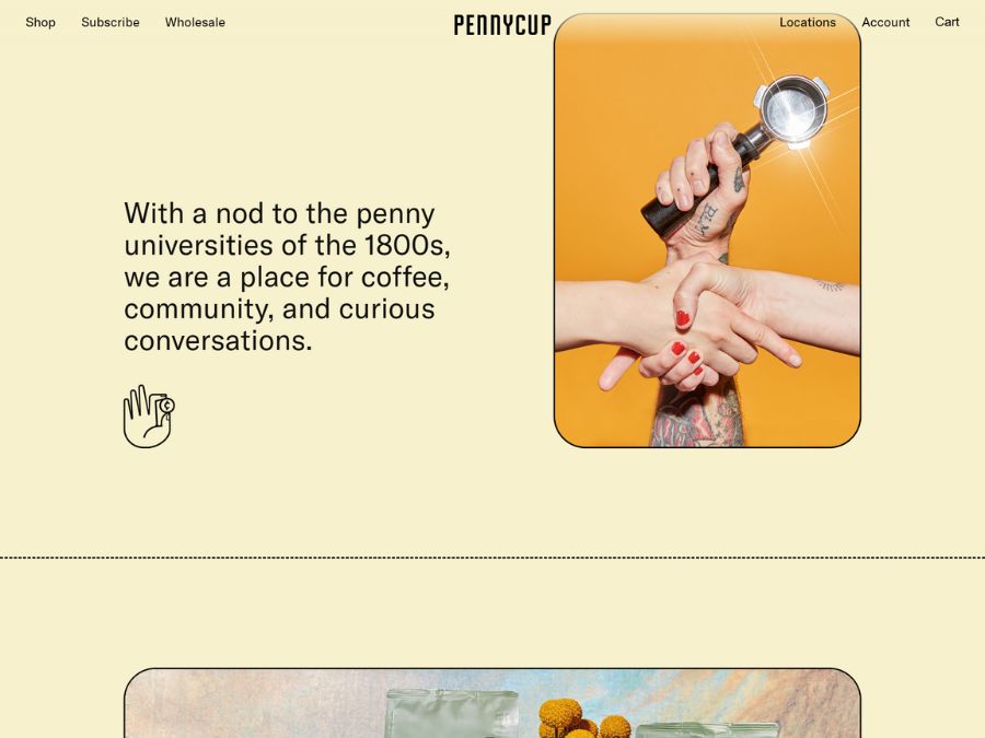
Why We Picked It
The layout pairs a centered hero with clearly defined navigation, making orientation effortless. Section spacing is consistent and unhurried, helping guide the viewer through information without compression. Typography establishes a clear hierarchy, and imagery is integrated in support of content rather than as a focal point. The overall composition feels balanced and thoughtfully paced.
Website details:
Industry: Coffee shop
City/State: Colorado Springs, CO
URL: https://www.pennycupcoffeeco.com/
Bridge & Tunnel Coffee Company
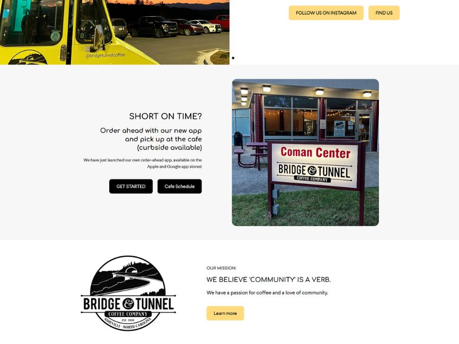
Why We Picked It
A bold opening treatment and confident type choices immediately communicate tone and focus. Navigation remains minimal, keeping attention on content rather than options. Spacing and typographic contrast create a steady reading rhythm throughout the site, while photography adds context without visual dominance. The design reflects a clear point of view carried consistently across pages.
Website details:
Industry: Coffee shop
City/State: Long Island, NY
URL: https://www.shopbtcc.com/
These websites represent a range of styles and approaches, but they share one thing in common: they feel designed with care.
As Digital Design Guild continues to grow, future roundups will include community voting and submissions, giving designers and business owners a chance to showcase thoughtful digital work from across the web.
If you’ve built or discovered a website that deserves recognition, we encourage you to submit it for consideration.