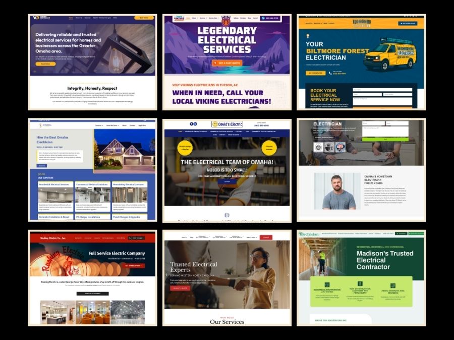
Best Electrician Websites
Great website design in the trades is rarely about flash or excess. It’s about clarity, restraint, and helping people understand complex services quickly and confidently. When design works well in this space, it often fades into the background by making information feel effortless to navigate.
For this roundup, we reviewed electrician websites from cities across the United States and selected examples that stood out because they felt intentionally designed. These are sites that organize services with clear reading order, use typography and spacing with confidence, and guide visitors through information without visual noise or distraction.
This list isn’t about scale or recognition. It’s about design that feels purposeful.
Volt Vikings Electrical
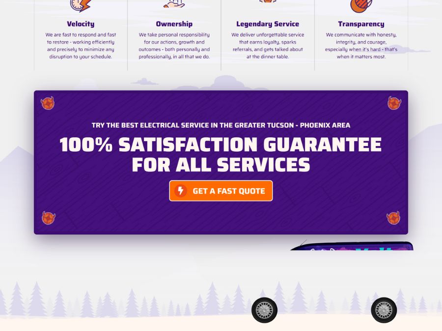
Why We Picked It
Content is arranged with disciplined consistency, using repeated layout patterns that reinforce structure as the page unfolds. Headings are clearly differentiated through scale rather than decoration, supporting a readable hierarchy. The restrained color palette keeps attention on layout and flow, while measured spacing prevents visual compression. The design relies on compositional balance rather than embellishment to communicate clarity.
Website details:
Industry: Electrician
City/State: Tucson, AZ
URL: https://voltvikings.com
Vision Electrical Services
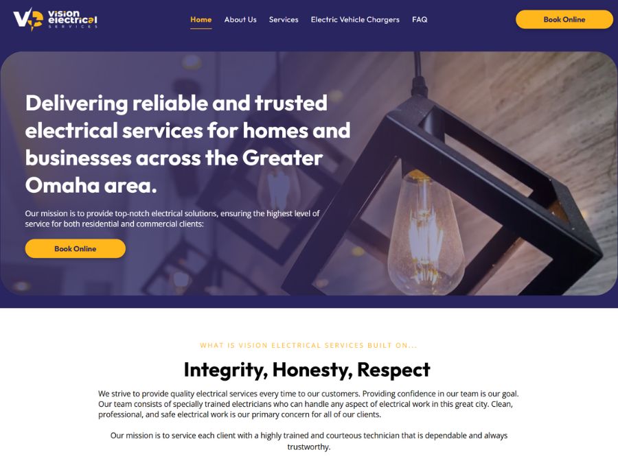
Why We Picked It
Multiple service offerings are managed through clearly separated content blocks that prevent visual overload. Spacing is consistent and measured, establishing a steady pacing across the page. Typographic hierarchy is subtle but effective, guiding attention without relying on dramatic contrast. The overall layout prioritizes information flow over decoration.
Website details:
Industry: Electrician
City/State: Columbus, OH
URL: https://www.visionelectrical.services/
The Neighborhood Electrician
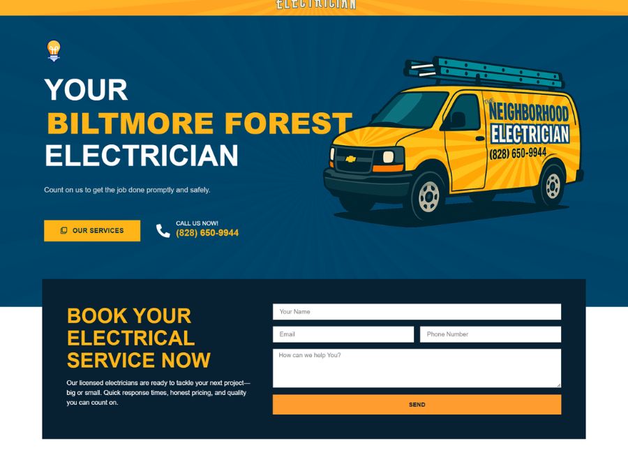
Why We Picked It
A centered hero and minimal navigation establish focus immediately. Content is spaced generously, giving each section room to stand on its own. Typography maintains an even rhythm, supporting a smooth reading flow from top to bottom. The site relies on restraint and alignment to communicate clarity rather than visual embellishment.
Website details:
Industry: Electrician
City/State: Arden, NC
URL: https://theneighborhoodelectrician.com/
JS Russell Electric
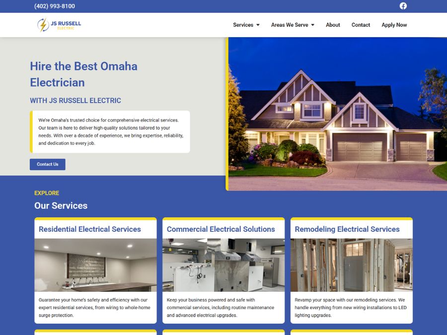
Why We Picked It
Whitespace plays a central role in shaping the experience, allowing sections to feel distinct without hard visual dividers. Typography is calm and evenly paced, creating a natural reading order from headline to body text. Navigation remains minimal and unobtrusive, keeping focus on content rather than interface elements. The overall structure feels resolved and intentional.
Website details:
Industry: Electrician
City/State: Omaha, NE
URL: https://jsrussellelectric.com/
CK Electric
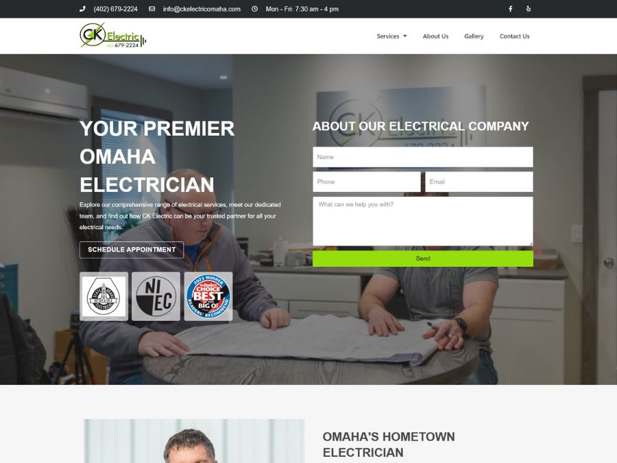
Why We Picked It
Information is broken into well-defined sections that clearly separate services, credentials, and contact details. Typographic hierarchy is established through scale and spacing rather than stylistic contrast, supporting easy scanning. Consistent margins and alignment give the layout breathing room and prevent crowding. The design maintains balance through repetition and restraint.
Website details:
Industry: Electrician
City/State: Omaha, NE
URL: https://ckelectricomaha.com/
Rushing Electric Co.
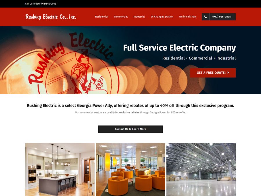
Why We Picked It
A clear reading sequence guides visitors from high-level services into supporting details without interruption. Headings are visually distinct and positioned predictably, reinforcing hierarchy across the page. Spacing between sections creates visual pauses that help manage information density. Icons and imagery add context while preserving focus on structure.
Website details:
Industry: Electrician
City/State: GardenCity, GA
URL: https://rushingelectric.com
Buckingham Electric Inc.
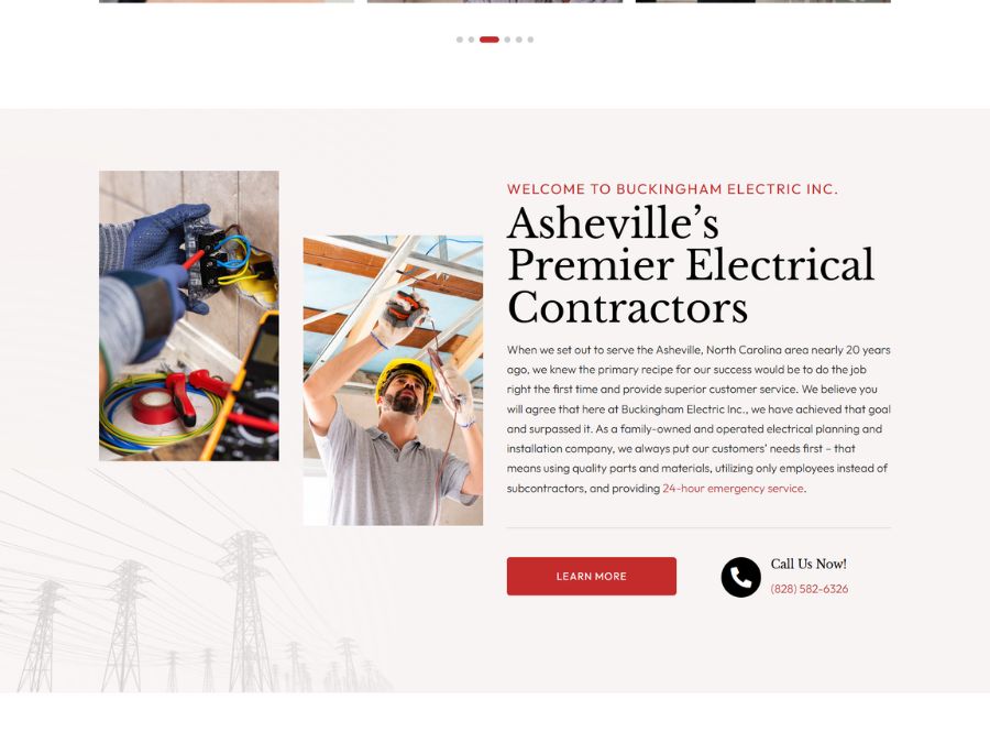
Why We Picked It
The layout prioritizes clarity by separating residential, commercial, and emergency services into clearly labeled sections. Navigation remains straightforward and visually restrained, avoiding unnecessary emphasis. Typography is consistent and legible, allowing content to guide the experience rather than decorative elements. The design feels functional but carefully composed.
Website details:
Industry: Electrician
City/State: Arden, NC
URL: https://buckinghamwnc.com/
The Electrician
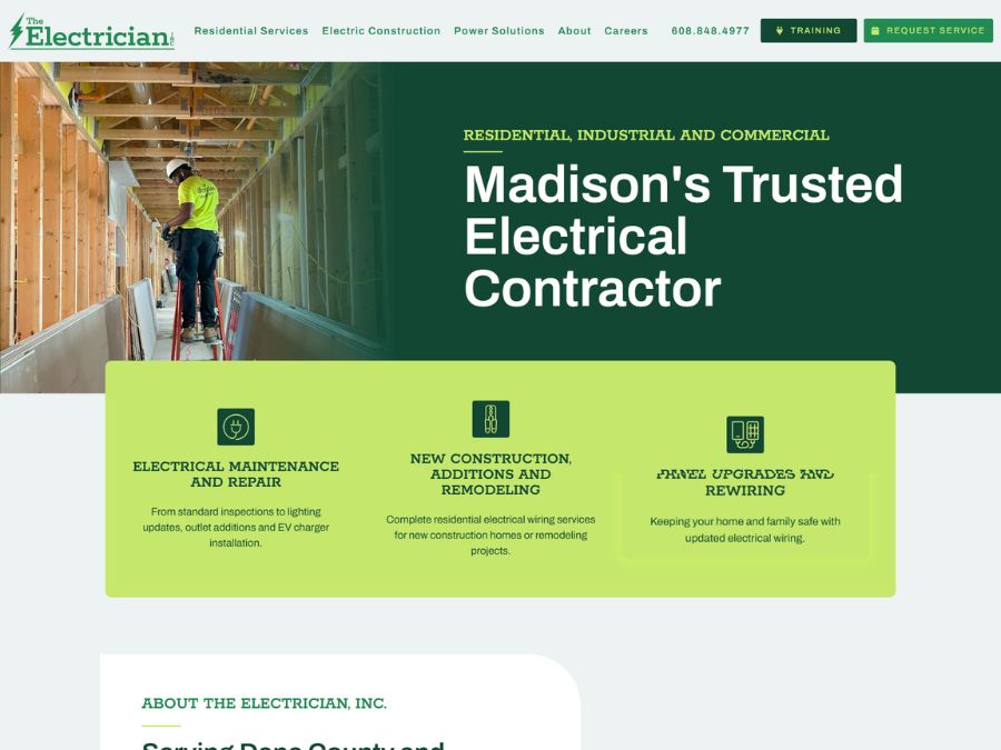
Why We Picked It
Consistent alignment and predictable section spacing create an orderly layout that is easy to navigate. Headings and subheadings are clearly distinguished, reinforcing hierarchy across service descriptions and practical information. Typography remains restrained throughout, supporting clarity without visual noise. The design emphasizes usability through simple, intentional structure.
Website details:
Industry: Electrician
City/State: Verona, WI
URL: https://theelectricianinc.com/
David’s Electric
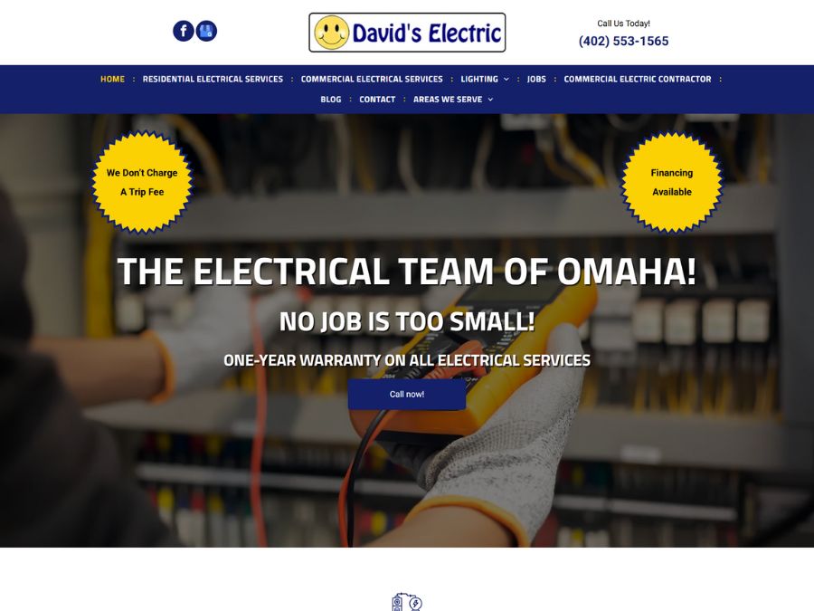
Why We Picked It
The structure pairs simple navigation with clearly segmented content, making information easy to digest. Generous margins and consistent alignment give the page a calm, ordered feel. Typography is legible and appropriately scaled, supporting hierarchy without excess styling. The design communicates essential details through deliberate layout decisions.
Website details:
Industry: Electrician
City/State: Omaha, NE
URL: https://www.davidselectricomaha.com/
These websites represent a range of styles and approaches, but they share one thing in common: they feel designed with care.
As Digital Design Guild continues to grow, future roundups will include community voting and submissions, giving designers and business owners a chance to showcase thoughtful digital work from across the web.
If you’ve built or discovered a website that deserves recognition, we encourage you to submit it for consideration.